
Page 6
Oct 02, 2015
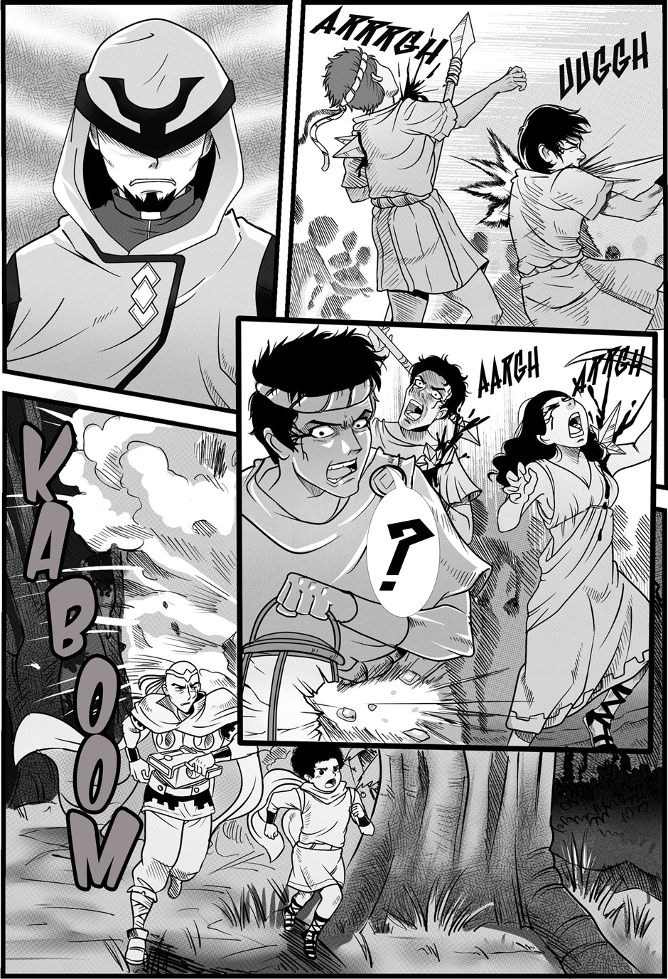
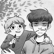
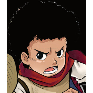
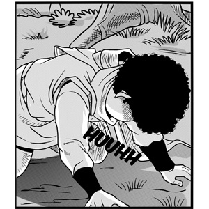
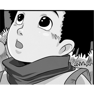
Well that's one way to lose them.
nomago
Top comment
The story is interesting. I like your drawing style, I like to USE the cartoonish style too. In The first chapter I thinking a lot how can I tell my opinion. Cuz I think The orange colour for The letters it was not a good idea, the red or the black is better choice. When I see First The letters and The background seems like in one layer and not separate. It not good to the human eyes, cuz hard to read the text. I like this comic, and I wait for The next chapter.
Recommendation for you
-
Recommendation
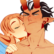
Do You Even Witch
BL 4.6m likes
-
Recommendation
Humor me
Slice of life 3m likes
-
Recommendation
Copper eyes
BL 1m likes
-
Recommendation
Satan and Me
Drama 2m likes
-
Recommendation
Out of the Blue
Romance 2.6m likes
-

Recommendation
Ghost Eyes
Thriller/Horror 1.8m likes
-
Feeling lucky
Random series you may like

Titans Twilight
4.2k views30 subscribers
Will Update Weekly.
The story takes places around Jaden, Amadis, Han, Zeva, Carterus on the planet of Lilyous. As they take on an ancient force known as the “Lords of Black” that has been on the planet since the dawn of man. They seek to unleash their plan to change thing for the people that live there forever.
The story takes places around Jaden, Amadis, Han, Zeva, Carterus on the planet of Lilyous. As they take on an ancient force known as the “Lords of Black” that has been on the planet since the dawn of man. They seek to unleash their plan to change thing for the people that live there forever.
Comments (1)
See all