

Page 6
Jul 04, 2020
Introducing the world's crappiest looking tablecloth! The shading behind the characters is also kinda sloppy (the gray I chose just makes things look kinda dirty or way too dark).
I'd mentioned using a custom font but I tested it out with this page and some letters would just sort of morph together and be hard to read, so until I feel like redoing it I'll be writing everything out by hand. I tried making the text a bit smaller so it looks thinner, but I don't know how much I like it. I also hadn't realized my pen pressure hadn't been working while doing the text so if the text looks weirder than normal then that's why.
Gah, sorry for all the complaints- I know it's a learning process and I'm going to be a bit crazy about making things as good as possible, even if it means only realizing how sucky everything is after the fact.
But anyway, about the actual page- I like certain things about it overall (I had way too much fun with those walls, haha) and we'll hopefully be getting into some slightly more fun stuff soon.
(Final note, promise- I'm hopefully going to change the main cover and thumbnail soon so there's a series cover that's different from the chapter one cover, as well as thumbnails to correspond with something relevant to the current chapter. I hope that all made sense... Anyway, look forward to it!)
Recommendation for you
-
Recommendation
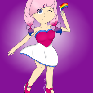
Dead City
LGBTQ+ 421.3k likes
-
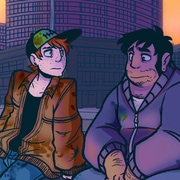
Recommendation
Out of the Blue
Romance 2.6m likes
-
Recommendation
Copper eyes
BL 1m likes
-
Recommendation
Humor me
Slice of life 3m likes
-
Recommendation
The Little Trashmaid
Comedy 720.2k likes
-
Recommendation
Strange and Wild
Fantasy 662.1k likes
-
Feeling lucky
Random series you may like
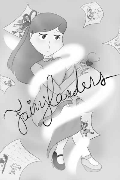
Fairylanders (NO LONGER UPDATING)
1.9k views8 subscribers
Fairylanders; the people who possess magical trinkets called Lockets, using their power to change the world. However, some Fairylanders, like the Wizard, have chosen to use their Lockets for nefarious purposes.
A young Fairylander named Red has chosen to stand against the Wizard and his schemes, calling upon the aid of several unexpected and slightly strange allies with powers like hers. However, no one ever said saving the world would be easy, and when a legendary Fairylander might be involved? Well, that's all part of the fun, isn't it?Read more
A young Fairylander named Red has chosen to stand against the Wizard and his schemes, calling upon the aid of several unexpected and slightly strange allies with powers like hers. However, no one ever said saving the world would be easy, and when a legendary Fairylander might be involved? Well, that's all part of the fun, isn't it?Read more


Comments (2)
See all