
Sawyer's Checkup
Aug 28, 2018


Nitelini
Top comment
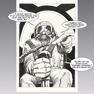
an advice guys, ake the text bigger or bold, the font is good but sometimes you strech it so much it makes it hard to read. there's no purpose on fitting all the text in the panel if it's not intelligible.
Recommendation for you
-

Recommendation
Out of the Blue
Romance 2.5m likes
-

Recommendation
Do You Even Witch
BL 4.6m likes
-

Recommendation
Humor me
Slice of life 2.9m likes
-

Recommendation
Copper eyes
BL 1m likes
-

Recommendation
Long Exposure
LGBTQ+ 2.4m likes
-

Recommendation
Strange and Wild
BL 639.7k likes
-

Feeling lucky
Random series you may like
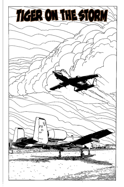
Tiger on the Storm
15.3k views33 subscribers
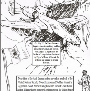
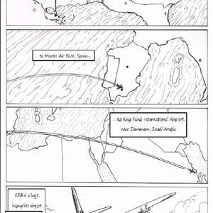
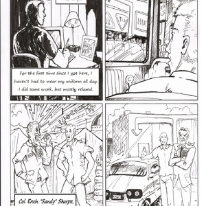
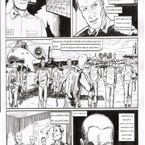
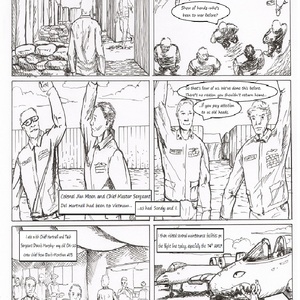
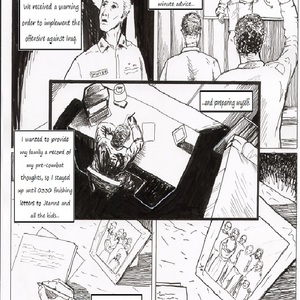
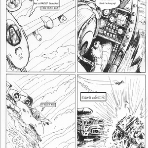
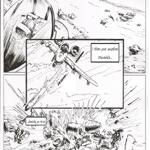
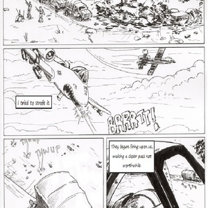
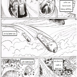
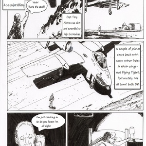
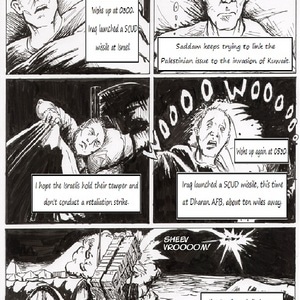
On August 2nd, 1990, Iraqi troops under Saddam Hussein invaded Kuwait. Most of the Arab League and the UN Security Council condemned the invasion. Saudi Arabia’s King Fahd and Kuwait’s Emir Jabber III requested assistance from the United States and other NATO nations against Saddam’s aggression. With no indication Saddam will withdraw his troops before the January 15, 1991 deadline, US troops arrive in Saudi Arabia, including the Air Force 23rd Tactical Fighter Wing under the command of then-Colonel David Sawyer.
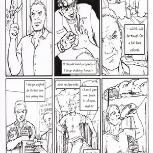
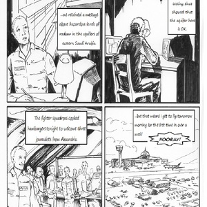
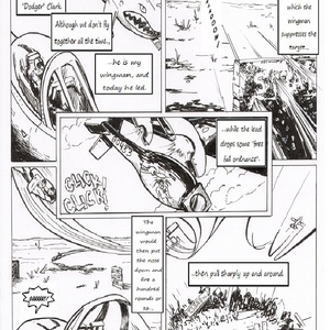
Based on the journal of the late Maj. Gen. David Sawyer, Tiger on the Storm honors the 23rd Tactical Fighter Wing and their service in Operation: Desert Storm.
Please help me continue this work with a tip or even just sharing. Thank you.Read more
Based on the journal of the late Maj. Gen. David Sawyer, Tiger on the Storm honors the 23rd Tactical Fighter Wing and their service in Operation: Desert Storm.
Please help me continue this work with a tip or even just sharing. Thank you.Read more


Comments (2)
See all